Blend4Web: Beginner's Guide. Chapter 5: Visual Appeal
2016-12-06
It looks like we have done everything we needed to do: the models are prepared, materials are created and textures have been added. But still, it seems that something is missing. Visually, the scene looks dull and lifeless. And, mind you, this is supposed to be a presentation. It should be bright and appealing, maybe even aggressively so.
But don’t be rushing off to add even more details or to hastily rework materials. Now, we will work with the environment – with all those little bits that can greatly improve the appearance.
Background, Lights and Shadows
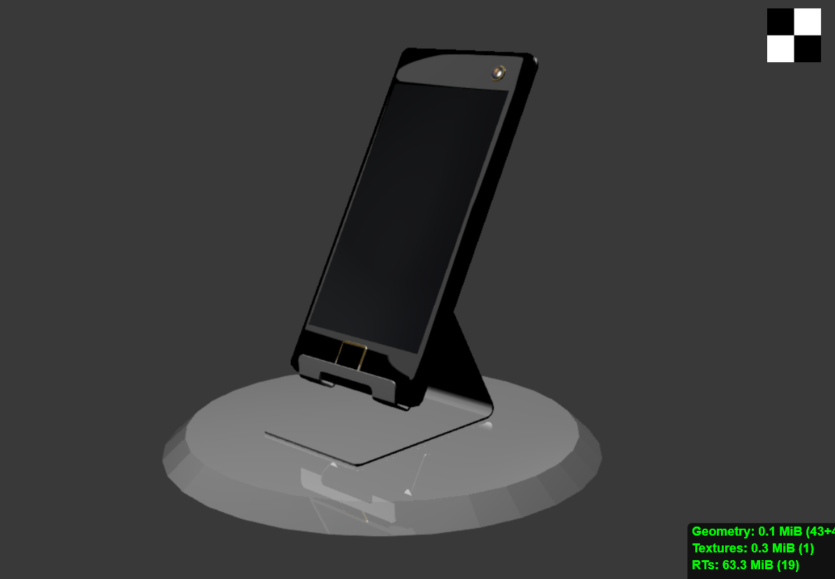
Figure 1
Take a look at the picture. This boring gray background can only bring on sadness. Of course, it shouldn’t shine and glitter with colors either, as this will distract attention from the model itself. What it should do is bring the model out, refine it, if you may.
The Properties window contains a panel with the fitting title of World. Here you can find the tools that will help us improve the look of our presentation.
Blender allows you to set any color for the scene background. Gray is used by default, and it is this color that should be visible in the Preview window of your project (see fig. 2). To replace this color with another, click the color sample tilted Horizon Color and set a shade you like. Also, turn on the Render Sky option.
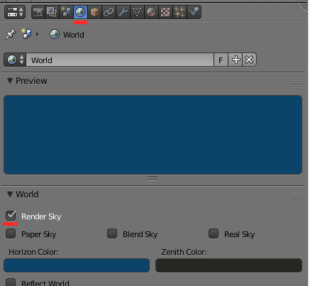
Figure 2
Now it looks a bit better, but still rather rough. It would be much more interesting if a gradient is applied.
Blender offers you a number of gradients. Some of them are fit for creating realistic environments such as atmosphere, but in our case we only need a simple transition between two colors.
For this, there is another color sample on the panel, entitled Zenith Color, which allows you to set the second color.
However, the most important thing is the sky blending mode. The program features a total of 3 options: Paper Sky, Blend Sky, Real Sky. You can achieve the effect you need by combining them.
To get a gradient, check the Blend Sky box. If you turn on the Real Sky option, the program will use the Horizon Color sample for coloring the horizon, while the Paper Sky option will “pinpoint” the background to the camera. If you leave this box unchecked, you will see the background change when the camera moves.
I personally like the black-blue gradient, but you can just as well choose any other (fig.3).
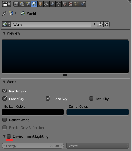
Figure 3
As you can see in the figure, I’ve enabled the Environment Lighting option. Turning it on can significantly improve the general perception of the picture.
You are already familiar with the Light object that acts as a light source in a scene. But Environment Light is a bit different. It has no origin point, no direction or other parameters. Its purpose is to monotonously light the entire scene. Imagine a dark room with a desk lamp pointed at an apple on the desk. One side of the apple, the one that is turned to the lamp, is bright and well lit. The other is dark and bleak, yet you can still see it, albeit not very clear. In reality, the lighting of a particular object is influenced by a plethora of factors that are simply impossible to take into account in a virtual world. In a 3D scene, the other side of the apple would be perfectly black.
Environment Light can be used to illuminate an object without using additional lamps. It only has two parameters: the Energy (the power) and the color of the light. You can also choose one of the three light source types:
White (white color).
Sky Color (background color).
Sky Texture (background texture color).
The decision, of course, depends on the type of the scene you are working on. For this particular scene I’ve set the Energy to 0.1 and the color to White.
So now we have both background and environment lighting, and the scene looks a little better, but something is still missing. Can you guess what it is?
The laws of physics state that light and shadow are inter-related. But before we take a look at the shadows, let’s look into the matter of light sources.
Blender gives you up to five types of lamps. To make sure of this, select a Lamp object in the scene and open the specific setting panel (fig. 4).
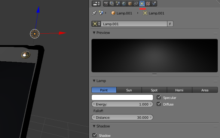
Figure 4
Let’s take a look at the features of the types of light sources that are most popular for real-time graphics. There are three of them:
Point is a point-type light source. It, in essence, is a simple light bulb that emits light evenly in all directions, but the light intensity fades with distance.
The name of the Sun type light accurately describes its function. This is a powerful light source, and its position in the scene does not matter in the slightest, only its direction (rotation angle) is taken into account.
Spot is searchlight-type source. Using it, you can emphasize a specific object in the scene. It is used in a manner similar to that of a real spotlight.
All these light sources share the same – and important – set of parameters:
Energy is the power of the light.
Shadow. Turn this on if you want this light source to generate shadows.
Color sets the color of the light.
By using different types of light sources and by playing with their parameters you can significantly improve the visual appeal of your presentation, but be careful. Having many light sources in the scene is very bad performance-wise. The developers of Blend4Web recommend to use no more than 8 “bulbs” per scene, but, truth be told, you better stick to two or three.
Another important nuance is shadows. Blend4Web support generating shadows from multiple light sources simultaneously. When you add a new light source to the scene, it already has the “Shadow” option enabled, but you won’t be seeing any shadows right away, as every object in the scene should be “told” to cast or receive shadows. This is done so an artist can decide for himself which objects will cast shadows, and from what particular source, as shadows not only make picture look a lot better, but significantly burden the system as well. You better get used to it, as real-time 3D graphics should be handled carefully.
Select an object you need and open the Object panel of the Properties window. Find the Shadows tab. The Cast Shadows parameter is used to make an object cast shadows, while the Receive Shadows - to receive shadows casted by other objects.
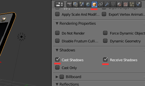
Figure 5
The Magic of Reflections
We’ve already discussed how to create reflective materials. However, that method had two major downsides, these being performance and the necessity to create objects for it to reflect. It is all right when you are looking in the mirror and only see you own face, but when you take said mirror outside, this becomes a whole different story. The sky, the buildings, the trees, the people – do you really have to model all this just to have a high-quality reflection?
A long long time ago video game developers came up with a trick. Instead of calculating reflections from numerous 3D objects, they decided to use a simple texture.
Environment Map (this is how such a texture is called) is a specifically created image, a panoramic view of a scene from a certain point (fig. 6).
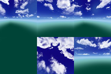
Figure 6
This is an environment map. It can be created using various software including Blender. I won’t go into details on this subject. Anyone interested, can check the official Blend4Web documentation, everything you need to know is described there. And, by the way, you can find some ready-made maps in the engine SDK or on the Internet.
Working with Environment Map is for the most part no different then with a regular texture, although there are some subtleties. Let’s take a look at a simple example.
I have decided that the reflective surfaces in my presentation will have chrome-like material. Reflective surfaces are both the holder and the metallic panel with a button that encircles the frame. These elements should be very reflective.
You don’t have to create a UV map to use environment textures. All you have to do is open the material you need and add a new texture slot.
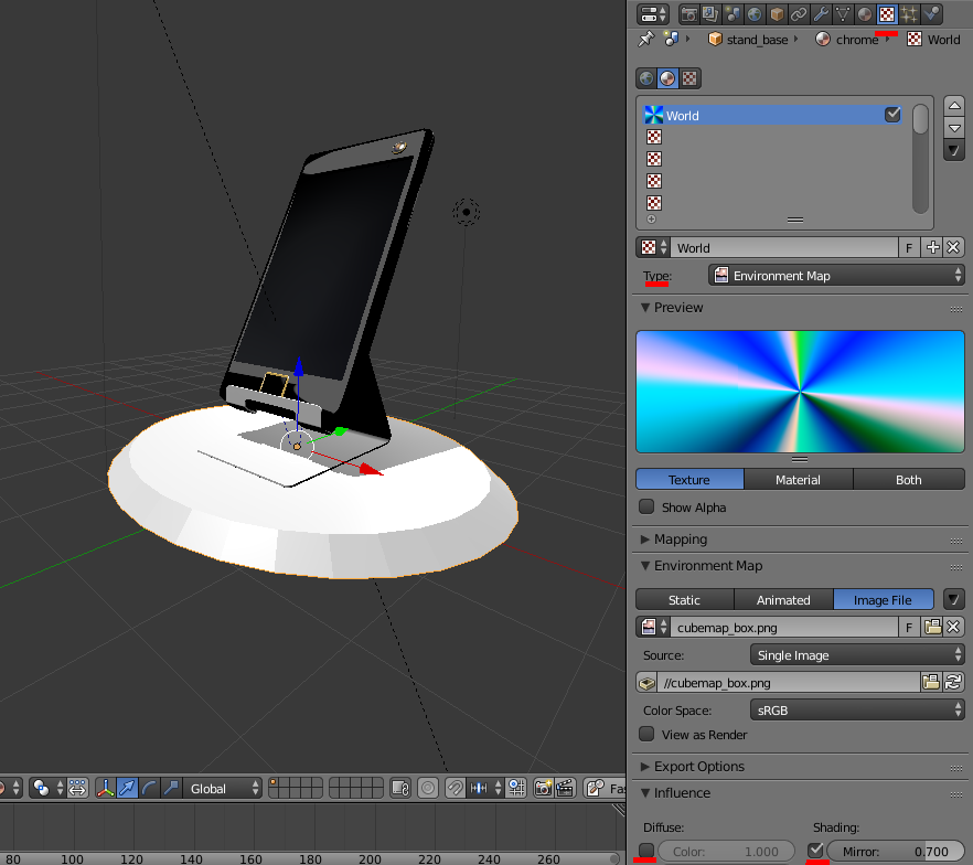
Figure 7
Take into account the type of the texture. You have to select Environment Map from the Type menu. After you load the texture, do the following steps:
1. Switch to the Influence tab and turn off the Color option.
2. Enable the Mirror option on the same tab. The higher the value of this parameter is, the more visible the environment map will be.
And that’s about it. With these simple means we were able to make our scene much more appealing. I like how it turned out. Do you?
Updated source files can be found in the Blend4Web SDK starting from version 16.12 (this applies to both CE and PRO versions). The files are located in the blend4web/blender/tutorials/basic/for_beginners folder.

