Сообщения, созданные пользователем Павел Котов
21 июня 2016 15:19
So I have an awesome friend in Canada, she is great at drawing - and also an architect. And some months ago I made one of her favourite pokemons, Sableye, as a birthday gift ![smiling-sunglasses]()
![]()
The main scene
With this scene (not only this one) actually started my experiments on node trees to make a fire![smiling]()
UPD: Attached sources
The .blend file. Everything is packed in![smiling]()
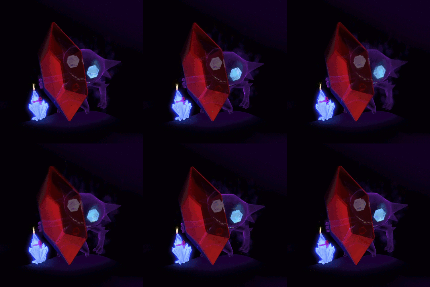
The main scene
With this scene (not only this one) actually started my experiments on node trees to make a fire
UPD: Attached sources
The .blend file. Everything is packed in
21 июня 2016 15:07
Живет в Канаде одна моя продруга, которая шикарнейше рисует, а еще и архитектор. И вот, несколько месяцев назад я ей на день рождения запилил ее любимого покемона ![smiling-sunglasses]()
![]()
Сама сценка
Примерно отсюда растут ноги моихизмываний над экспериментов с нодами для эмуляции пламени ![grinning-smiling-eyes]()
.blend - файл. Все запаковано![smiling]()

Сама сценка
Примерно отсюда растут ноги моих
.blend - файл. Все запаковано
17 июня 2016 10:47
Yeah I thought it'll be easy, but I'll be honest - it is painful to try to dig through the file ![open-moth-tightly-closed-eyes]()
When I have time tho, I'll try to solve the riddle. For now it seems to me that animations could be optimized - that could free around 10-20mb or so. There are just so many things. If you try to remove objects one-by-one, you could find what actually eats more memory . It'll help me as well :)
And about this mouse thing - yeah, from the box you can't do this. But maybe this will help?
14 июня 2016 10:49
10 июня 2016 12:27
Wooooah! That's cool, man! I love the interactivity, how it's made!
I have some things to recommend tho. I'd recommend to limit camera zoom, to set the body of the drummer to "Disable Frustrum Culling" so it won't disappear (Object tab, Rendering Properties panel). Also maybe it'll look cooler if you extend the tail of the fuel burning? Maybe some smoke?
Ok, now for your questions:
As you can see, they blocked the camera from moving. It wasn't made just because, there's a deep meaning. Like on 2d webpage, the cursor runs in 2D, while your object is in 3D. It can be done through coding, but it won't satisfy you if you want to rotate the camera. I spoke with our programmers about that some months ago, this seems easy but is pretty much unconvenient.
Can you please attach your files? 40mb is too much for that king of scene, something totally needs to be optimized. I'd look through it to see what weights so much.
About the dropbox and html stuff - I don't know :( Maybe someone else can have a clue what's going on.
Anyway, good luck with your project, it really is looking great so far!
I have some things to recommend tho. I'd recommend to limit camera zoom, to set the body of the drummer to "Disable Frustrum Culling" so it won't disappear (Object tab, Rendering Properties panel). Also maybe it'll look cooler if you extend the tail of the fuel burning? Maybe some smoke?
Ok, now for your questions:
) I want to make a portfolio page in B4W now, and thought that it would be awesome if the content would follow the users cursor automatically, similar to this page here: http://inear.se/visualeyezer/
As you can see, they blocked the camera from moving. It wasn't made just because, there's a deep meaning. Like on 2d webpage, the cursor runs in 2D, while your object is in 3D. It can be done through coding, but it won't satisfy you if you want to rotate the camera. I spoke with our programmers about that some months ago, this seems easy but is pretty much unconvenient.
Can you please attach your files? 40mb is too much for that king of scene, something totally needs to be optimized. I'd look through it to see what weights so much.
About the dropbox and html stuff - I don't know :( Maybe someone else can have a clue what's going on.
Anyway, good luck with your project, it really is looking great so far!
08 июня 2016 14:53
Просто в моем представлении (а я фанат космической тематики) звезды как раз и дадут такой легкий энвайронмент-эффект, т.к. они более - менее равномерно распределены по небу. Т.е. одно солнце будет давать день-ночь, а "звезды" будут подсвечивать планету все время.
Или же вы просто хотите, чтобы звезды не исчезали днем?
Или же вы просто хотите, чтобы звезды не исчезали днем?
07 июня 2016 15:53
07 июня 2016 15:18
An outstanding installation for Sleepdebt's Gravity album made by dalenatran (whos Tumblr blog is also made using Blend4Web and looks pretty interesting)
![]()
![]()
GIF compilation by prosthetic knowledge
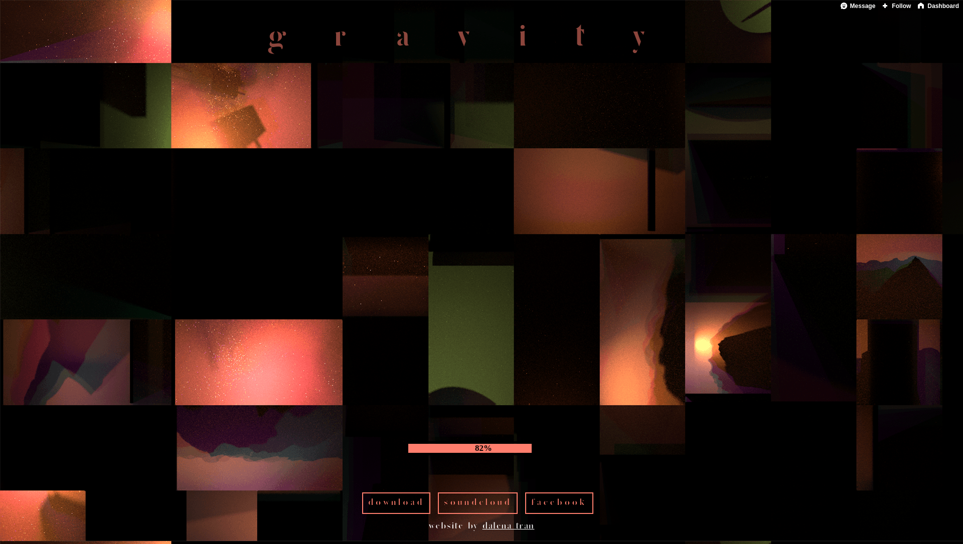
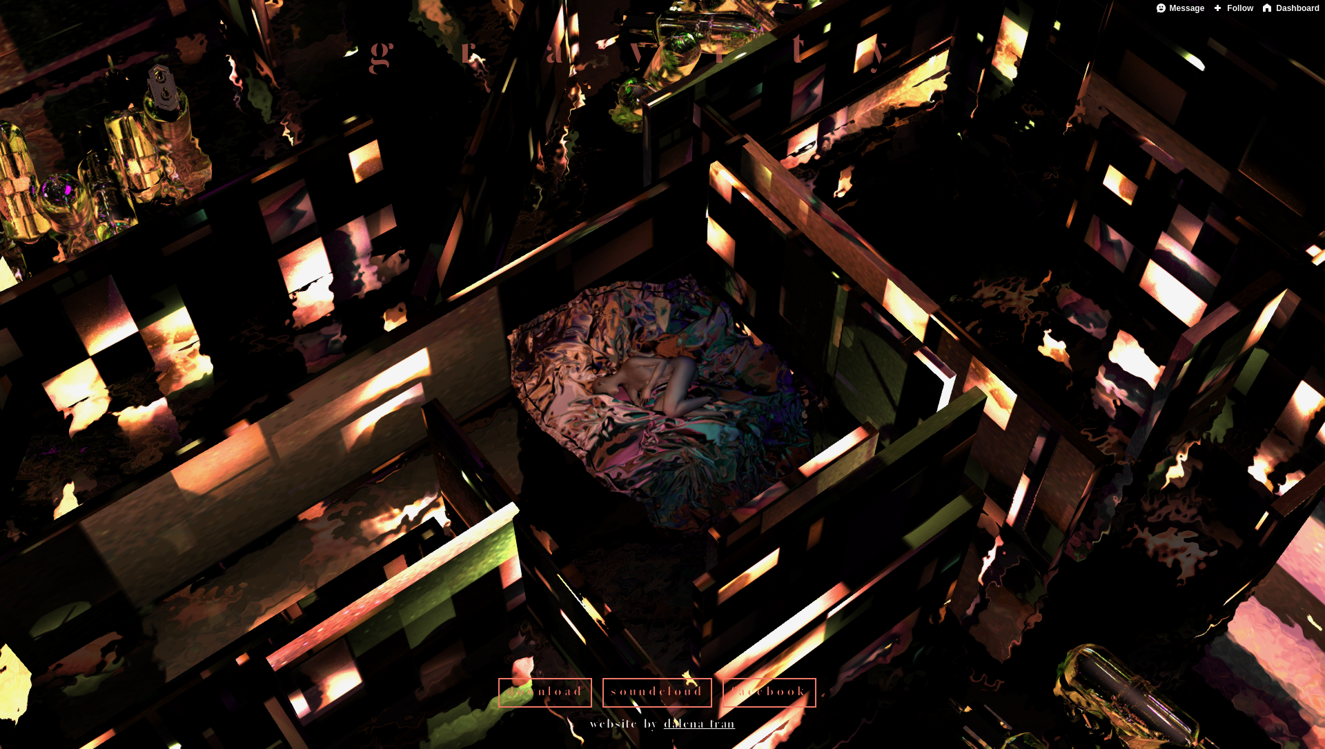
GIF compilation by prosthetic knowledge
07 июня 2016 15:04
Замечательная инсталляция для альбома Gravity исполнителя Sleepdebt из Манчестера, созданная dalenatran (чей блог на Tumblr также сделан на Blend4Web и выглядит очень атмосферно)
![]()
![]()
gif-подборка от prosthetic knowledge


gif-подборка от prosthetic knowledge

