User posts Tamas P.
11 November 2016 12:17
Hi Everyone!
Congratulations to the winners! - and of course to everyone else who made something to the contest!
In most of them i found very good ideas, so now i understand why the judges said, its hard to choose the best works.
But clearly my personal favourite scene is AngryArticFox's work. He did an amazing job! Professional modelling and overall look, but the really best part is the interaction with the camera.![smiling]() If he made a lower quality composition but with this type of interaction, i would be very sad if he not catch the 1st place.
If he made a lower quality composition but with this type of interaction, i would be very sad if he not catch the 1st place.
My second fav is veti's Merecedes. A masterpiece in graphic quality but i missed the real interaction from the scene. The configurator better suited to a new car so what i imagine, when you first posted a wip image/html is an old garage with rusty barrels, god rays through dusty window or a streetside scene etc.
- somebody who can make this quality how to miss to use camera limits![winking]()
The third and last favourite the second place winner. Good looking car, average graphics but i really like the originality of the contol panel, gas pedal etc. Nice work!
To the others, as a wrote above… in almost every work i found something special.
To judge my own work… really hard to remain objective. But i think i have no problems with the look and the idea to connect an average car to a tv series which made it memorable.
I understand the judges opinion with the dynamic reflections, and i am really angry to myself because the first try a made this with an env.map. But why i made with dynrefs? Because i am optimalizing.
In my opinion the optimalization already means small file size (mobile download), loading time, green light in scene viewer![smiling]() and naturally good running performance, minimum or zero glitches on any device (camera movement, unrendered objects, unstoppable anims)!
and naturally good running performance, minimum or zero glitches on any device (camera movement, unrendered objects, unstoppable anims)!
So when i first export - the finished - scene it was 35MB and the loading time is 18sec… terrible! What i reached is 8,1 MB the smallest in the contestants, and ~5sec loading time in hq mode on my - not a high end - mobile phone 4,1s on a 5yo pc. I used b4wquality node to change textures to simple colors (when the user switch between quality modes can reach better performance but with lower graphic), use rgb channels for bw images if(!) it results smaller file size etc.
I think i made a big mistake here, but changing between quality modes is a built in feature.
I learned from that so when i optimizing the scene i am not useing this option.
Finally B4W is a really good way to spread 3D, big thank for anybody who works on it, and yeah we want more contests!!!![smiling]()
![smiling]()
![smiling]()
Congratulations to the winners! - and of course to everyone else who made something to the contest!
In most of them i found very good ideas, so now i understand why the judges said, its hard to choose the best works.
But clearly my personal favourite scene is AngryArticFox's work. He did an amazing job! Professional modelling and overall look, but the really best part is the interaction with the camera.
My second fav is veti's Merecedes. A masterpiece in graphic quality but i missed the real interaction from the scene. The configurator better suited to a new car so what i imagine, when you first posted a wip image/html is an old garage with rusty barrels, god rays through dusty window or a streetside scene etc.
- somebody who can make this quality how to miss to use camera limits
The third and last favourite the second place winner. Good looking car, average graphics but i really like the originality of the contol panel, gas pedal etc. Nice work!
To the others, as a wrote above… in almost every work i found something special.
To judge my own work… really hard to remain objective. But i think i have no problems with the look and the idea to connect an average car to a tv series which made it memorable.
I understand the judges opinion with the dynamic reflections, and i am really angry to myself because the first try a made this with an env.map. But why i made with dynrefs? Because i am optimalizing.
In my opinion the optimalization already means small file size (mobile download), loading time, green light in scene viewer
So when i first export - the finished - scene it was 35MB and the loading time is 18sec… terrible! What i reached is 8,1 MB the smallest in the contestants, and ~5sec loading time in hq mode on my - not a high end - mobile phone 4,1s on a 5yo pc. I used b4wquality node to change textures to simple colors (when the user switch between quality modes can reach better performance but with lower graphic), use rgb channels for bw images if(!) it results smaller file size etc.
I think i made a big mistake here, but changing between quality modes is a built in feature.
I learned from that so when i optimizing the scene i am not useing this option.
Finally B4W is a really good way to spread 3D, big thank for anybody who works on it, and yeah we want more contests!!!
09 November 2016 17:28
how you did the nla animations
Hi,
here is your file. In the text editor you find the step by step guide.
My project uses a lot of NLA actions, and you only see the finished result, not the how to… but after you make one, u can study that.
shelbyMGT500.zip
08 November 2016 22:46
please check it and tell me the right way of doing itHi!
Im downloaded your file, I saw you try everything but miss the right way
B4W is really easy to use if you check the powerful documentation. Tomorrow I clean up your file, and make an animation to the left door, and write a step by step guide how you can make the same with the right door.
If you can understand what you make and why you make it in that way, you can easily make complex animated scenes with NLA. Using armature not bad either, but - i think - nla is better for that.
Tomi
07 November 2016 10:04
Hi Everyone!
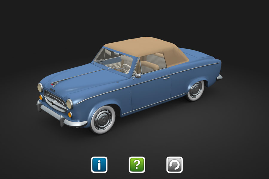
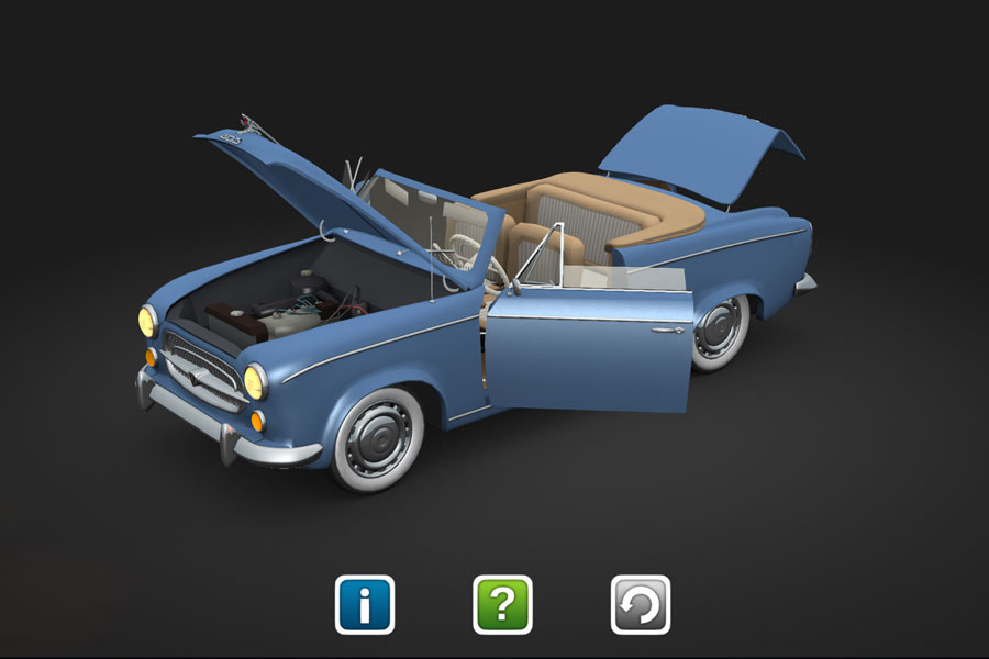
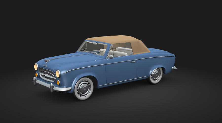
B4W Retro Car Contest - Peugeot 403 Cabriolet
Here is my work to the Retro Car Contest. Not a real classic in normal sense, but it becomes that if you can connect it something else… so the main idea my fav detective tv series.
See it, try it, play it!
![]()
![]()
Project source: B4W-RCC-Project-Peugeot-403.zip
Html: b4w-retro-car-peugeot-403.html
Tomi
edit (11.08 10:17): project name (reference to the post in retro car discussion forum)
B4W Retro Car Contest - Peugeot 403 Cabriolet
Here is my work to the Retro Car Contest. Not a real classic in normal sense, but it becomes that if you can connect it something else… so the main idea my fav detective tv series.
See it, try it, play it!


Project source: B4W-RCC-Project-Peugeot-403.zip
Html: b4w-retro-car-peugeot-403.html
Tomi
edit (11.08 10:17): project name (reference to the post in retro car discussion forum)
05 November 2016 15:28
Oh its simple (if i correctly understand what you want):
on the material tab -> transparent ADD -> rendering options Render above all
Here is a simple scene with "front" and "back" texts. On the "back" applied that material… looks always front, maybe use shadeless option to avoid "light glitches".
on the material tab -> transparent ADD -> rendering options Render above all
Here is a simple scene with "front" and "back" texts. On the "back" applied that material… looks always front, maybe use shadeless option to avoid "light glitches".
05 November 2016 11:36
A year ago i made a transparent skull and head (different colors), with not transparent teeths. I use a transparent material to the head but with render above all option, so you can saw the skull "under" that… so the head material always the first you saw!
I cant try yet what the correct way to reach that, but experiment this… …make a transparent material but use max alpha and check "render above…" not all alpha (a.blend, a.sort etc.) types support that.
If i correct the result is an always visible object/material…
It is good for hud elements if you want that. - if i can make this again, i send a blend to you
05 November 2016 11:17
04 November 2016 22:03
04 November 2016 12:06
Hi everyone!
Here is a screenshot from my actual work. Not finished yet, some textures and a little more optimalization needed, but i succeeded to reduce the starting export size from 35mb to under 8mb. Baked textures, lot of (a really lot) nla, and a little game![winking]() …
…
![]()
…but i need a little help! One thing is not working. I dont know how to replace the B4W glow node in low quality mode (because it is simple black…). I try to combine with the B4W LoQ node but not working.
Edit: I forgot to add an output to the glow material
Here is a screenshot from my actual work. Not finished yet, some textures and a little more optimalization needed, but i succeeded to reduce the starting export size from 35mb to under 8mb. Baked textures, lot of (a really lot) nla, and a little game

…but i need a little help! One thing is not working. I dont know how to replace the B4W glow node in low quality mode (because it is simple black…). I try to combine with the B4W LoQ node but not working.
Edit: I forgot to add an output to the glow material

